Progressive Disclosure

The Basic Idea

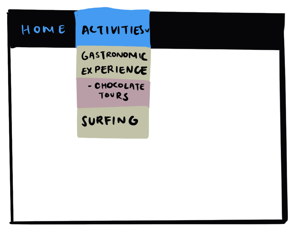
Imagine that you’re planning a trip to Oaxaca, Mexico. You know that the city is famous for its food, and especially its chocolate. To construct the perfect itinerary your first step would be to find a travel website that includes information on accommodations, transport options, and activities (hopefully something chocolate-specific). 

Now, imagine you find a page with all of this, only its content is one gigantic and continuous block of text. Your perfect vacation would immediately transform from a relaxing getaway to an overwhelming task. You’d be swamped with choices and wouldn’t know where to start. The solution? Progressive disclosure. 

Progressive disclosure in user interface (UI) design promotes intuitive navigation through strategic data organization. It’s about carefully grouping content into manageable sections and revealing them only when the user requests them. For example, imagine this travel website had a tab where you could click “Activities.” Clicking on this would lead you to a subsection titled “Gastronomic Experiences” which, upon selection, would display options including “Chocolate Tours.” 

The main goal behind progressive disclosure is to guide users through complex digital environments by presenting only the most relevant data at each step, thus decreasing cognitive overload. These designs intend to help the user make informed decisions that feel effortless and intuitive. 

Not only does this design strategy empower users by giving them control over their navigation experience, but it also simplifies their journey by allowing them to choose the options or sections that meet their needs. In our hypothetical scenario, after selecting the “Activities” tab, you’d find options like “Gastronomic Experiences” and “Surfing”. Because you’re already interested you naturally gravitate towards “Gastronomic Experiences,” ignoring “Surfing” entirely. Progressive disclosure allows the user to discard or ignore irrelevant information so they don’t have to sift through anything they aren’t interested in.

It might seem simple, but having information displayed little by little makes users feel in control. Another common example is when you’re using an e-commerce site and you reach the payment section. You probably first encounter a page asking for your name and shipping details, you click next, select express or standard shipping, click next, and finally input payment details. During this final step, it's common that the details only expand once you select a debit card/Apple Pay/PayPal etc—this being another type of progressive disclosure.

Progressive disclosure usually involves one or more of the following design styles:1

  • Accordions: Collapsible sections of content. A user clicks on a header to expand or collapse the content area.
  • Tabs: They organize content across different panels. Each tab is clickable, displaying its own content area without leaving the page.
  • Dropdown Menus: These are menus that appear when a user interacts with a button or link. They provide a list of options or actions available.
  • Scrolling: A simple yet effective way to progressively disclose information by allowing users to move vertically or horizontally through content at their own pace, revealing more details as they go.
  • Dialog Boxes & Popups: These are small windows that appear on top of the webpage content to provide additional information, alerts, or to capture user inputs, without navigating away from the current task.

Another example of progressive disclosure is when you’re buying clothes or products that might have hidden tabs with details, size charts, specifications, and reviews. The point here is to not overwhelm the user with numbers and specifics, but still have it available for those who might need it or find this important. It’s not only a functionality tool but it contributes to an aesthetically pleasing website.

Progressive disclosure is the best tool so far: show people the basics first, and once they understand that, allow them to get to the expert features


Jakob Nielsen, Creator of Progressive disclosure

Theory, meet practice

TDL is an applied research consultancy. In our work, we leverage the insights of diverse fields—from psychology and economics to machine learning and behavioral data science—to sculpt targeted solutions to nuanced problems.

Our consulting services

Key Terms

  • User Experience (UX): UX describes the overall experience a user has when interacting with a product, system, or service. The goal of UX design is to create simple, effective, relevant, and overall enjoyable experiences for the user. UX design considers the why, what, and how of a product from the user's perspective.2
  • UX Design: The process of designing products, systems, or services with the user's experience in mind. It involves a comprehensive understanding of users, what they need, what they value, their skills, and also their limitations. It also considers the business goals and objectives.2
  • Interaction Design: Design focused on creating engaging & intuitive interfaces which consider the interaction between users and products or systems.
  • Cognitive Overload: A state where too much information or too many tasks at once exceed a user's cognitive capacity, leading to confusion, errors, or abandonment.
  • Information Hierarchy: Organizing data in a way that reflects its level of importance, guiding the user's focus to primary actions or content.
  • Interface Clutter: The overcrowding of a user interface with excessive information, options, or commands, which can hinder usability and aesthetics.

History

Jakob Nielsen, co-founder of the Nielsen Norman Group, proposed ten usability principles during the early 1990’s. These principles included suggestions to make intuitive and user-friendly products. They started to gradually influence a shift towards simpler designs that also reduced user errors.3

Although progressive disclosure had been in the conversations around design, Nielsen helped emphasize its importance in UX Design. He believed that understanding the limits of human cognition could prevent information overload. Applying a progressive disclosure design would ensure that users are shown only the information they currently need and understand. Interface clutter would be reduced or better organized and users would have engaging and less intimidating experiences.

Interestingly, the concept of progressive disclosure isn’t only applied in the digital world; we can find it in unexpected places such as amusement parks. Similar to how digital interfaces reveal information gradually to prevent overload, amusement parks cleverly apply this principle to the design of queues. You might have noticed how lineups for rides twist and turn, hiding the length and the end/where you get on the ride. This method, parallel to progressive disclosure in the digital world, manages visitor’s expectations by revealing the line’s progress in stages. Some amusement parks even make you go through different rooms that often introduce more sounds and visual elements as you advance—creating a sense of anticipation and reward. This gradual increase in engagement mirrors the main goal of progressive design in UX: revealing information or features of the ride gradually to enhance the overall experience and anticipation for the riders—without overwhelming them with how long the wait actually is.

Consequences

Progressive disclosure plays a crucial role in enhancing user experience by breaking down complex tasks into smaller, more manageable steps, and presenting only the most essential information. This approach not only simplifies interfaces, making them easier to understand and navigate but also significantly reduces cognitive load. 

By limiting the amount of information displayed at any given time, progressive disclosure minimizes the mental effort users must expend to process information, allowing them to concentrate more effectively on the task at hand. 

In general, the human brain finds satisfaction in tidy and categorized information. Physical (or digital) clutter is often related to “mental clutter.” When we’re confused or anxious our thoughts feel like they’re all over the place. On the other hand, positive feelings are associated with organization and well-being. For example, most of us find some level of satisfaction in looking at a clean room or an organized desk—it makes us feel more in control. Thus, in the digital realm, having organized tabs and menus triggers these positive feelings, making users feel good about or trust in a product or system.5

Progressive disclosure increases engagement because processes have clear steps that help complete a task efficiently. This eliminates the need for users to extensively explore and examine the interface beforehand, enables them to sequence tasks in a way that matches their expectations and enhances overall ease of use.

Controversies

Containing or hiding information from users can actually deter them from clicking or opening different features that might be valuable or useful. As a user, you might be interested in something buried in a couple of accordions or dropdown menus. 

Also, “hiding” information through progressive disclosure can be frustrating, you may know the feature exists but you don’t know how to find it. For example, you might want to check your spelling in a Word document, but you have no idea which of all the tabs contain this option. Most products or websites are aware of this issue and insert a “search” feature. These aren’t always perfect and you may still need to watch a YouTube tutorial to figure out how to activate a specific feature. 

These types of situations highlight the importance of using multiple compatible design strategies when building a website. Incorporating multiple strategies, such as progressive disclosure to gradually reveal information and visual hierarchy to prioritize content, is essential for creating a user-friendly website that guides visitors seamlessly through the interface, ensuring an intuitive and engaging browsing experience. No one trick is going to cut it for every user. Knowing how to blend them right and making all web features work their best is crucial.

Excessive progressive disclosure can overwhelm users with too much information or too many steps, leading to confusion and frustration. Users may feel lost or unable to navigate through the interface effectively. Some information is better suited when presented together, rather than being separated on different pages or tabs. 

Although progressive disclosure intends to make systems simple, overdoing it can cause the opposite. Users may feel like they’re wasting their time clicking on a bunch of tabs and menus. The take-home message is that progressive disclosure is a great tool for organizing information and categorizing your users' knowledge, but it has to be well-designed. User testing can help to determine what “well-designed” means and other design tools can be incorporated to refine and enhance the user experience.

Case Study 

A Glimpse Through the Clutter 

A study published in 2021, explored how clutter on websites might affect user attention and search efficiency. Researchers used eye-tracking technology to understand how after a few seconds of looking at a website, gaze patterns changed significantly depending on how cluttered the site was.

The experiment involved showing participants 40 screenshots of existing e-commerce websites from clothing to event ticketing that had various levels of clutter. Participants were also assigned either word or image search targets on these screenshots. Some were under time pressure to mimic real-world scenarios where users need information immediately.

Findings showed that clutter significantly affects where and how quickly users can locate information. Within the first three seconds of looking at the screenshots, participants’ “attention dispersal” was significantly different depending on the level of clutter. The sites that were cluttered caused participants to focus dispersedly, which meant they had trouble focusing on important information amongst the confusion and noise. What is interesting about this study is that this result was true regardless of whether they had a time constraint.

The conclusions of this research highlighted the importance of designing clear and simple websites. Recognizing the impact that clutter has on user attention can lead to better structures within digital spaces that aid easier navigation and positive user experiences.6

Related TDL Articles

Card Sorting

This piece explores how card sorting optimizes navigation and information architecture, enhancing usability and reducing cognitive effort in digital interfaces.

Contextual Inquiry

This article dives into how observing users in their natural environment can reveal crucial design improvements, fostering intuitive and user-centered digital experiences.

References

  1. UX Pin. (n.d. )What is Progressive Disclosure? Show & Hide the Right Information. Retrieved March 20, 2024 from https://www.uxpin.com/studio/blog/what-is-progressive-disclosure/
  2. Interaction Design Foundation. (n.d.). UX Design. Retrieved March 12, 2024, from https://www.interaction-design.org/literature/topics/ux-design
  3. Guimares, F. (2022.). Nielsen’s Heuristics: 10 Usability Principles To Improve UI Design. Retrieved March 20, 2024 from https://aelaschool.com/en/interactiondesign/10-usability-heuristics-ui-design/
  4. Canvs Editorial (2020). Progressive disclosure: Designing for human attention and retention. Retrieved March 20, 2024 from https://uxdesign.cc/progressive-disclosure-91ea681eab70
  5. Gordon, S. (2023). The Connection Between Decluttering, Cleaning, and Mental Health. Retrieved March 20 from https://www.verywellmind.com/how-mental-health-and-cleaning-are-connected-5097496
  6. Kanaan, M., & Moacdieh, N. M. (2021). How do we react to cluttered displays? Evidence from the first seconds of visual search in websites. Ergonomics, 64(11), 1452–1464. https://doi.org/10.1080/00140139.2021.1927200

About the Author

The Decision Lab

The Decision Lab

The Decision Lab is a Canadian think-tank dedicated to democratizing behavioral science through research and analysis. We apply behavioral science to create social good in the public and private sectors.

Read Next

Notes illustration

Eager to learn about how behavioral science can help your organization?