Heatmaps

The Basic Idea

If you’ve ever watched a nature documentary where a nocturnal animal is being monitored, or a movie depicting a manhunt at night in a remote location, you’re probably familiar with thermal imaging. A special thermal camera is pointed at an area which then converts infrared radiation (heat) into a visible image depicting the spatial distribution of temperature differences1. Red, yellow, and orange typically represent hotter and warmer zones (such as human or animal body heat), while purple, blue, and dark blue represent colder zones. 

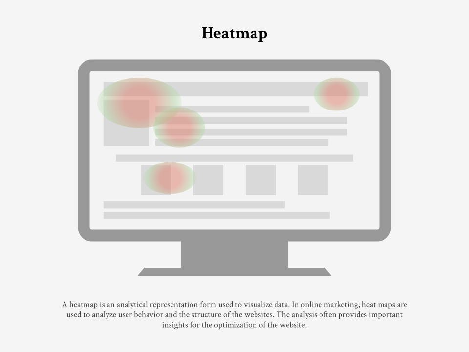
Now, if you substitute temperature for other types of data, such as rainfall, clicks on a website, or footfall in a mall, you get what’s called a heatmap.  
Heatmaps are a type of data visualization tool used to depict the distribution and intensity of values across two-dimensional spaces. By using colors to represent values in a dataset, heatmaps enable users to get an overall sense of complex datasets at a glance rather than spending hours sifting through numbers. 

Heatmaps come in all shapes, sizes, and colors depending on the data they are representing. Broadly speaking, they can be categorized into ‘spatial’ or ‘grid’. Spatial heatmaps visualize the distribution and intensity of data across a geographical area or digital space. They are commonly used in fields such as geography, urban planning, environmental science, and website design to depict varying levels of activity, concentration, or values in specific locations. 

Grid heatmaps, on the other hand, organize and display data in a grid-like structure. Unlike continuous spatial heatmaps that represent data over a specified area, a grid heatmap showcases information across different categories or variables. Grid heatmaps are useful for presenting structured datasets and can be applied in various domains, including finance, biology, and data analysis.

Heatmap

Grid Heat Map

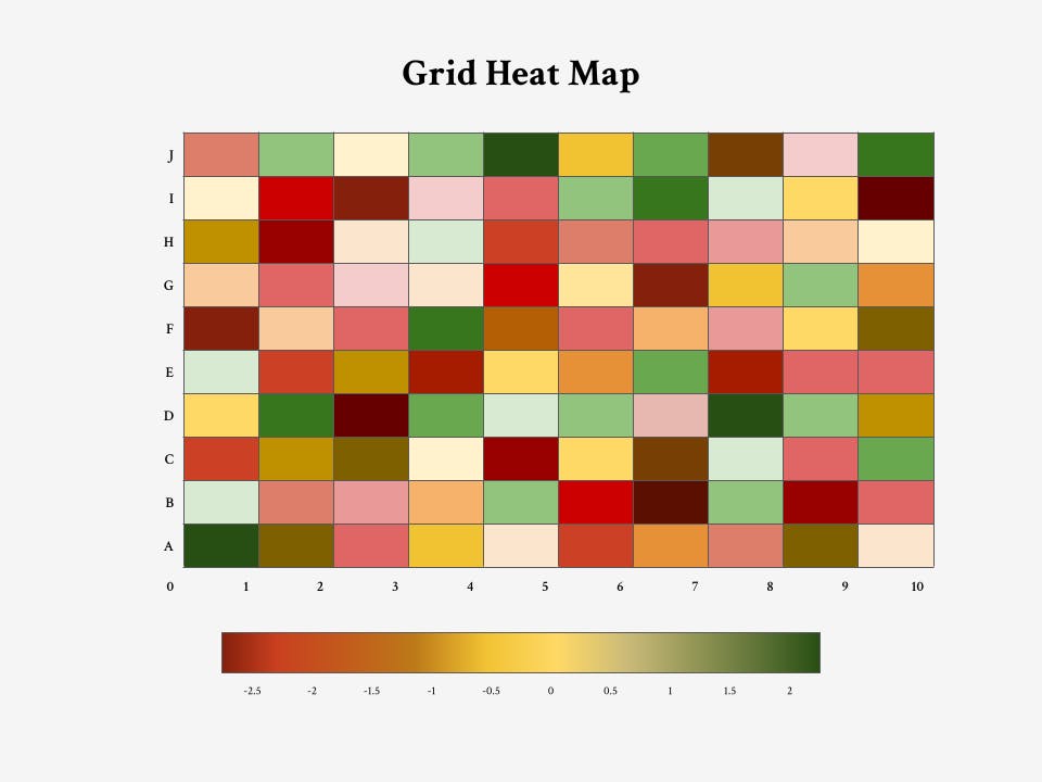
The most common color scheme used in heatmaps is warm-to-cool (e.g. red to blue), with the warmer colors representing high-value data points and the cooler colors representing low-value data points. 

Heatmaps are sometimes mistaken for choropleth maps as both forms of data visualization use color schemes to display the density of data. Imagine a map of the United States where mobile phone ownership in each state is represented by a different hue of blue (light blue showing low mobile phone ownership and dark blue showing high mobile phone ownership). Because the data represented is confined by geographical boundaries it is classified as a choropleth map. The effects of weather or pollution are often represented by heatmaps as these phenomena are not impacted by geographical or societal boundaries.  

The greatest value of a picture is when it forces us to notice what we never expected to see.


John Tukey, author of Exploratory Data Analysis

Key Terms

Intensity: the strength or magnitude of a value at a specific point in the heatmap, typically represented by color saturation (e.g. dark red to light red). 

Color Scale: a range of colors used to represent different values in a heatmap. Common color scales include gradients from cool to warm or vice versa.

Choropleth Map: a type of thematic map in which areas, such as countries, states, or regions, are shaded or patterned in proportion to the value of a variable being represented. These maps are particularly useful for visualizing spatial patterns and variations in data across geographic regions.

Isochrone Map: a visual representation that depicts the area accessible from a point within a certain period. Isochrone maps are often employed in transportation planning, urban development, and location-based analysis, enabling users to assess travel times to various destinations. 

Data Visualization: the graphical representation of data to facilitate understanding, interpretation, and analysis. The goal of data visualization is to transform raw data into visual patterns, trends, and insights, making it easier for individuals, businesses, and organizations to make informed decisions and communicate complex information effectively. 

Python: a high-level, interpreted, and general-purpose programming language known for its readability and simplicity. 

History

French statistician Toussaint Loua first used heatmaps in 1873 to track social statistics (such as nationality, profession, age, and social class) across 20 different arrondissements (quarters) of Paris.2 To represent his data, Loua hand drew a grid heatmap with a color scale ranging from white (low) through yellow and blue to red (high). 

Almost a decade later, Francis Galton created the world’s first commute time map which showed travel times in 1881 from London to different parts of the world.3 The travel times were measured in days, with less than 10 days shown in green, 20-40 days shown in pink, and more than 40 days shown in brown. Although Galton’s contribution would be classified as an isochrone map, the idea of representing the distribution and intensity of values using different colors paved the way for the later development of the heatmap. 

Despite having been around for over a century, the term ‘heatmap’ was trademarked in 1991 by Cormac Kinney, an American fintech entrepreneur (spoiler alert—he let the trademark lapse and eventually lost it). Kinney and some of his colleagues developed computer-generated heatmaps which were described as “2D display[s] depicting financial market information.”4  Over the next few years, Kinney started cold calling banks and financial traders to sell his computer software and by the end of 1997 he had installed heatmaps in 50 Wall Street brokerages, with a $200 monthly charge per user.5 

The demand for understanding users’ behavior on websites increased as more people became connected to the internet. Online sites, such as Crazy Egg,6 started selling different kinds of heatmap analytics to help designers discover website issues and optimize user experience. A few years later, in 2013, a Python package named Seaborn was introduced which allowed people to create different kinds of heatmaps within the Python programming language. 

Today, heatmaps have become an integral part of data analysis and visualization toolkits, offering a powerful means to communicate complex information in an accessible and visually engaging way. The continued evolution of technology and the growing emphasis on data-driven decision-making ensure that heatmaps will remain a valuable tool moving forward.

People

Toussaint Loua

French statistician credited for inventing the heatmap. His first grid heatmap was created in 1873 to track social statistics across different parts of Paris. 

Cormac Kinney

American fintech entrepreneur who trademarked the term ‘heatmap’ in 1991 and pioneered the use of heatmaps in the finance industry.

Consequences

Why do we need heatmaps and why are they so effective? It’s actually quite simple. The human brain processes visual information better than numbers, text, or written data. Raw visual information is processed by a part of the brain called the thalamus which is much older than the cerebral cortex (where numbers and text are dealt with). It only takes us a few hundred milliseconds to process visual stimuli, thus reducing cognitive load. So, by replacing numbers with colors, heatmaps offer ways to analyze data that are more aligned with our cognitive processes and much quicker. 

Across many fields, heatmaps are excellent tools for identifying patterns, trends, and relationships within datasets. Regardless of how much someone loves data and numbers, heatmaps make otherwise dull or impenetrable data understandable and easy to interpret. Heatmaps are also useful for making complex data more accessible to broader audiences who may not want, or need, to understand the finer details of what’s happening.

In certain areas, such as website and UX design, heatmaps can be a cost-efficient way to understand how users are interacting with products. For the same time and money spent on conducting user testing with 10 people, a heatmap may provide you with data from thousands of users. The data is also available quickly, making it easier to make changes to platforms more efficiently. 

Controversies

One of the inherent flaws in using heatmaps doesn’t come from the tool itself, but from limitations in our visual perception. Because our brains find it difficult to accurately judge intensities of different hues, it can be hard for the human eye to discern exact numbers on a heatmap, even when using a continuous scale. When two sections of an image are adjacent, we notice a sharp contrast between their colors. Conversely, we aren’t great at comparing shading when two regions are not next to one another.7 In other words, we compare color shading relatively, not objectively. 

This perceptual phenomenon, first published by visual scientist Edward H. Adelson in 1995, is called the ‘checker shadow illusion.’8 Adelson produced an image depicting a checkerboard with alternating light and dark squares, partly shadowed by a cylindrical object. Although area ‘A’ appears to be darker in color than area ‘B’, both squares are the same shade of gray. 

When it comes to website heatmaps, some argue that while they look appealing and authoritative, their data may not actually be useful. Take clickmaps, for instance, which visualize the areas on a website where users click the most. When navigating a new website, you may need to explore by clicking different areas to eventually find what you are looking for. Or you may click the wrong section by accident. Clicks, therefore, don’t tell us whether a link is problematic, good, bad, or popular, they just tell us about the hierarchy of the web page. Importantly, they don’t tell us why someone clicked where they did. Just because an element on a page gets attention, doesn’t necessarily mean that it’s important.

How hot is your website?

Heatmaps have become an indispensable tool for User Experience (UX) designers to understand users’ behaviors when visiting a website or using a digital interface. Areas with the highest color intensity, and therefore most user engagement, are called ‘hotspots’, while areas with the cooler colors, indicating lower interaction, are called ‘coldspots’. 

Users engage with websites in multiple ways and as such, there are many different heatmaps to determine users’ actions. When these heatmaps are analyzed collectively, they highlight the best and worst performing parts of a website, providing designers with insights on where and how to improve UX experience and website engagement. Here are some of the specific heatmaps used for website analysis and what they can tell us: 

  • Mouse Tracking: Also known as ‘hover maps’, mouse tracking heatmaps are used to visualize where website users hover their cursor. The idea behind mouse tracking is that people often hover their mouse over areas they are reading or interacting with. 
  • Eye tracking: These heatmaps measure the eye position of the website's users and gather measurements about where people fix their gaze and for how long. Like mouse tracking, these maps offer insights into where users focus their attention while browsing.
  • Clickmaps: Also known as ‘touch maps’, click heatmaps display the number of clicks received on any given part of a website. The more clicks an area receives, the greater the user engagement. These heatmaps not only tell designers where users may encounter friction (such as non-clickable elements that they expect to be interactive), they can also help to enhance site navigation by arranging elements to align with visitors’ behaviors. 
  • Scrollmaps: These heatmaps are used to represent the scrolling behavior of visitors to a website. This information helps designers understand the point at which users lose interest in scrolling which, in turn, informs them of the optimal scroll depth for placing important information.

Combining the insights from various heatmaps is important for gaining a holistic and comprehensive overview of visitors’ interactions with a website. Relying solely on the information from one heatmap can lead to inaccurate conclusions. Consider mouse tracking and eye tracking, for example. The data from both may not be perfectly correlated because people may hover their cursor over an area while their eyes are focused on something else.9 Designers may adapt or remove content based on the mouse-related data when they should really be looking at what people are doing with their eyes. 

Case study

Heatmaps for student learning  

Heatmaps are not just useful for representing existing data, but can also be used as a tool for gathering new data. During the COVID-19 pandemic, classrooms across the globe moved online, making it more difficult for educators to interact with their students and monitor their skill development. In the United States, the Systems Education Experience (SEE), a STEM program which works directly with high school students and teachers, accepted four times the number of students during the pandemic, leading to concerns about the quality of the service. 

To ensure that the program remained effective and engaging for students, The National Science Teaching Association (NSTA) created heatmaps for students to use to gauge, track, and communicate their perceptions of their skills development over multiple weeks10. The heatmaps measured 16 general skills applicable to the NSTA’s programming-systems thinking skills and were completed on a weekly basis. 

The students involved in the project enjoyed using the heatmap and were able to customize the colors to suit their own style. The heatmaps enabled the students to visualize their strengths and weaknesses and how they changed over time, linking them to the work they did during the course. Overall, heatmaps were viewed not just as a way to visualize, track, and reflect on skills development, but as a meaningful educational activity in and of itself. In particular, the organizers of the program noted how the activity increased student engagement and enabled students to have a voice in their own learning. 

Related TDL Content

How Heat Affects our Behavior and Decision-Making

Heatmaps help designers and analysts make data-driven decisions. But did you know that real heat can have a significant impact on our decision-making processes? In this article, Lindsay Turk looks at the impact of climate change and rising temperatures on our behaviors and in particular, the ‘heat hypothesis’ which describes why you might feel a little more irritable when the mercury starts to rise. 

References

  1.  Havens, K. J., & Sharp, E. J. (2016). Thermal Imaging Techniques to Survey and Monitor Animals in the Wild. Academic Press. 
  2. Inforiver. (n.d.). Heatmaps in Data Visualization: A Comprehensive Introduction. Inforiver. https://inforiver.com/insights/heatmaps-in-data-visualization-a-comprehensive-introduction/
  3. Badley, M. (2022, June 27). Using heat maps for qualitative data visualization. HelloInfo. https://helloinfo.global/blog/heat-maps
  4. Sisodia, N. (2021, September 24). Your Guide to Creating Commute Time Visualisation Maps. TravelTime. https://traveltime.com/blog/commute-time-visualization-map
  5. Forbes. (1999, May 17). Hot Stuff. Forbes. https://www.forbes.com/global/1999/0517/0210064a.html?sh=3b69561424b1
  6. Crazy Egg. (n.d.). Homepage. Crazy Egg. https://www.crazyegg.com
  7. Bock, T. (n.d.). Too Hot to Handle? Problem with Heatmaps. DisplayR. https://www.displayr.com/the-problem-with-heatmaps/#:~:text=However%2C%20basic%20psychology%20tells%20us,think%20in%20terms%20of%20relativities.
  8. Adelson, E. H. (2005). Checkershadow Illusion. Perceptual Science Group, MIT. 
  9. Howuku. (n.d.). Eye Tracking Heatmap. Howuku. https://howuku.com/heatmap-glossary/eye-tracking-heatmap
  10. McLaughlin Ludwig, C. (2023). Heat Maps as a Fun and Instructive Way to Gauge Student Perceptions on Skill Development. Connected Science Learning, 5(5), National Science Teaching Association.https://www.nsta.org/connected-science-learning/connected-science-learning-september-october-2023/heat-maps-fun-and

About the Author

Read Next

Notes illustration

Eager to learn about how behavioral science can help your organization?