Mobile First Design

The Basic Idea

Have you ever had to search the web on your cell phone and run into issues navigating the website? Maybe the design is too large for your phone, so you need to continuously drag your screen to navigate the website, or, the site’s features are so minuscule that you need to aggressively zoom in just to click a button. Thankfully, we are facing this problem less and less due to the rise in popularity of mobile-first design.

But what is it? Mobile-first design is an approach to creating digital product designs that prioritize the small-screen experience of using a mobile device. Essentially, a product’s user interface (UI) is prototyped for smaller screens first before designers work their way up to larger screens like desktops.

The mobile-first design approach bears similarities with progressive enhancement—a user experience principle that states that digital design should start with its “bare bone” features and end with the most sophisticated model. Comparatively, mobile-first design uses smartphone screen capacity to prioritize key features (or, what’s absolutely necessary) and progresses to a more advanced version as the digital device becomes larger (i.e. laptops, desktops). 

The rationale behind this ideology can be summed up in two points. One, designing for small screens makes it easier to design for larger screens. This is similar to how it is easier to write with a minimum word requirement than a maximum because writing with a maximum word count requires the writer to be concise–a tricky feat in a world full of information. Second, the smallest designs will only contain the vital features so what you have on the mobile device outlines the core of your user interface design. 

Below are examples of layouts designers can use with different digital devices. Notice the difference between designs? The smaller and restricted screen real estate of a smartphone calls for a unique list of content to prioritize. The mobile-first design approach starts with designing with the smartphone view first and ends with the desktop view.

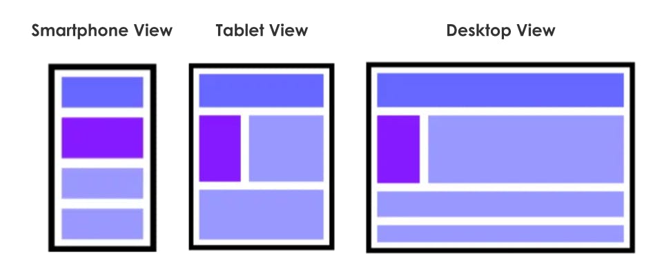
Images source: A Hands-On Guide to Mobile-First Responsive Design, Studio by UXPin (2015)

This approach to design arose from the growing use of mobile phones to surf the web. Since 2017, these devices have accounted for more than half of the web traffic we experience.1 With more people browsing the internet on their smartphones than ever before, it’s essential to ensure that websites are designed to provide an excellent experience on devices with limited screen real estate.

Now that we’ve established the crux of mobile-first design, let’s get down to how we can go about doing it.2, 3

Content first

Create an inventory of all the content you want to include in your design and then make a priority list of the items in the inventory.

Design

Deliver an intuitive design that is created for the smallest screen possible. That way, it can be used as a model for larger screens (remember progressive enhancement). Also, because we are designing for a handheld device, be sure to enlarge the buttons for users to press.  

What to avoid

To prevent crowding up the limited space you have to avoid large, complex graphics and pop-ups that end up taking up too much room. It would also be wise to avoid hover effects not only because it is distracting but because using a finger to navigate the screen makes it impossible.

Test, test, test

The best way to know whether your design works is to test it! User testing is an extremely valuable tool to figure out what went well and what went wrong with a design directly from the user.

Mobile will ultimately be the way you provision most of your services… the answer should always be mobile-first.


Eric Schmidt, CEO of Google in 2010

Theory, meet practice

TDL is an applied research consultancy. In our work, we leverage the insights of diverse fields—from psychology and economics to machine learning and behavioral data science—to sculpt targeted solutions to nuanced problems.

Our consulting services

Key Terms

  • User Interface: The medium that the user interacts with to communicate with a device, software, or computer. It encapsulates all the visual and interactive details from buttons to menu bars to input fields that users control for the device to return a response.
  • Progressive Enhancement: A design strategy that focuses on starting with a baseline prototype containing all the essential features and developing that, in layers, into a more complex and functional product.4
  • Graceful Degradation: The opposite of progressive enhancement. It is a design strategy that calls for building a prototype containing all the features for full functionality and then gradually boiling down the complexity of the design in stages.5
  • Responsive Web Design: An approach suggesting that websites should be designed to adapt well to the user’s device. Ultimately, the design should look good across a variety of devices no matter the size of the display.
  • Usability Testing: A process of evaluating a digital product by testing it on users to see how it fairs in terms of functionality and overall user experience.

History

Websites used to be designed with the assumption that they would be accessed on a desktop computer. This is unsurprising given that computers were the “it” technology by the end of the 20th century. As we know, the evolution of digital devices didn’t end with the desktop—quickly there became a wider range of screen sizes to account for.

In 2003, web developers Steven Champeon and Nick Finck introduced a new design strategy known as progressive enhancement which put website content at the forefront.6 When this design process is used, anyone can access the basic content and functionality of a website, regardless of the device. Users with the appropriate medium to support more features or a speedier internet connection automatically receive the enhanced version of the site.

The concept of progressive enhancement sparked the era of responsive web design, a term coined by Ethan Marcotte in the 2010s which means a design can work seamlessly across devices.7 With the rise of handheld smartphone devices, there was a clear shift in the priorities of web designers. Luke Wroblewski, a prominent designer and writer, popularized the concept of mobile-first design in his book “Mobile First” which was published in 2011. Wroblewski took the stance that designing for mobile devices pushed designers to prioritize essential content and functionality, leading to better overall user experiences. By 2016, the responsive web design approach dominated the design space with Google launching their mobile-first strategy. This time marked a paradigm shift that set off a chain reaction.

The rise of mobile devices and their growing widespread usage signaled the transition from mobile-friendly designs to mobile-first.8 While mobile-friendly means that a web browser will condense the site’s content to prevent the overflow of information on the smaller device, mobile-first means prioritizing a design that can organize content on the small screen. Since more than half of web browsers were accessed through a mobile device in 2023, the rise of mobile-first design is an appropriate response to keep up with user behavior.9

People

Luke Wroblewski: A respected web designer and writer with expertise in user interface design, mobile design, and product strategy. In his book, Mobile First, he advocated for the adoption of mobile-first design practices which popularized the approach in the UX community.

Eric Schmidt: An American technology executive known for his leadership roles at Google and Alphabet Inc. During his time at Google, he announced that the company would prioritize and refocus on smartphone users and their needs. This marked a shift in how tech companies should go about designing their products and gave way to the rise of mobile-first design.

Ethan Marcotte: A web designer who coined the term “responsive web design”. He advocated for designers to create websites that can seamlessly adapt to a variety of screen sizes and devices. This approach to design opened the door to mobile-first design.

Steven Champeon: A web developer who sought to improve browser compatibility and accessibility. He started initiatives to promote best practices in web design and development. Together with Nick Finck, they introduced a new design approach known as progressive enhancement which laid the groundwork for mobile-first design.

Nick Finck: A UX and web developer, Finck is popular in the field for his emphasis on user-centered design principles.

Consequences

Not only is the proliferation of mobile usage reflected in sales data but close to half of Americans think they have a smartphone addiction.10 We use our phones for just about everything, so it makes sense that there is a shift toward mobile-first design. But how is it making a positive change to how we design websites?

Since mobile-first design brings user needs to the forefront by prioritizing the content that they will find most useful, it calls for a better user experience overall. Attention spans are shorter when surfing the web on a mobile device, because of this, mobile-designed websites offer a more optimized and well-thought-out user experience.11  

This design approach also increases accessibility to the web. There are mobile functions that designers can include in their websites that wouldn’t be possible with a desktop. Additionally, cell phones being mobile means that people can surf the web from just about anywhere with an internet connection. 

Finally, mobile-first designs offer better website performance.12 A core tenet of good website performance is mobile optimization. So, the better a design is for mobile use, the easier it is to use which in turn leads to an optimal website performance. Simple!

Controversies

While designing for the mobile-first aligns with the mobile domination trend we see today, an obvious downside to this is that it leaves desktop users with a suboptimal experience. The culprit? Content dispersion.

Mobile-first web designs use the practice of enlarging elements to make the content more readable on a smaller screen. But, translating this design into a larger desktop screen causes the issue of content being overly spread out on the screen (A.K.A content dispersion). This forces users to excessively scroll through a page to digest the content. Plus, with desktops having larger screens, it would be a silly choice to enlarge content for readability if desktops don’t even run into such an issue.

By forcing users to have to scroll through a page to read the content, dispersed content can increase users’ cognitive load. Users are required to burn more mental energy and effort while navigating a website which can lead to frustration and fatigue. This frustration can play out into decreased satisfaction with the website because of the time-consuming nature of scrolling through.

Indeed, the results of a study conducted by a team of researchers from the Nielsen Norman Group reflected the same idea.13 The study carried out 13 usability tests looking at two web layouts (condensed and dispersed) and two webpage types (homepage and product page) for four different website prototypes. The participants performed a series of activities to test the usability of the website which was capped off with semi-structured interviews to provide space for discussion about their experience. It was found that content dispersion contributed to decreased user comprehension, increased cognitive load, and increased user frustration.

But this is not to say that designers should be backing away from mobile-first design approach. Mobile-first design has revolutionized the tech design space. But by accentuating progressive enhancement, responsive web design, and user testing, designers can alleviate the incompatibility of mobile-first designs on desktop screens.14

Case Study

Google’s Mobile-First Indexing

The 2010s was a decade when Google shifted its priorities from desktop to mobile devices. As a result, Google implemented the practice of mobile-first indexing which illustrates their ongoing effort to support smooth user experiences for the growing number of mobile users. What happens is that Google’s web crawler will first index the mobile version of a web page before the desktop version when trying to find web pages that match the user’s query. The indexing process will come to inform the search results the user sees and their order.

What this means is that if a webpage does not provide a smooth mobile user experience, it could negatively impact how high it ranks on the search results (if it even shows up). Considering that Google announced that they will expand their mobile indexing practices to the whole web in 2020, it is ever more important for web developers and designers to adopt the mobile-first design approach.15 What’s the point of putting all the effort into designing a beautiful website if it is not even going to show up on Google’s search results? 

Pitchfork’s Menu Tab

A sleek example of a well-thought-out mobile-first design is Pitchfork’s site, an online music publication platform. Browsing the web on your phone, you might find the menu tab situated in the top right corner of your phone. But with the advent of bigger phones with bigger screens, it is quite tricky to reach that button with one hand. Pitchfork ingeniously places the menu tab on the bottom right corner of the page. That way, you can easily tap and view the menu options with ease. This simple design choice allows users to navigate the Pitchfork website with one hand—something that future web designers should take note of and implement.

Related TDL Content

User Interface

A core component of mobile-first design is considering how the user interface would look on a small screen. But what is a user interface? In a nutshell, it describes the space where the human and computer interact. Check out TDL’s article for a deep dive into the world of user interface, from its history to case study examples and everything in between.

Wireframing

A way to facilitate the design aspect of mobile-first design is through wireframing. It is the method of producing what is essentially a blueprint for the structure of a website or app. But how exactly did wireframing come to be and what are the implications of wireframing on website development? Find out more in TDL’s article.

References

  1. Oberlo. (n.d.). What Percentage of Internet Traffic is Mobile? | Oberlo. Www.oberlo.com. https://www.oberlo.com/statistics/mobile-internet-traffic
  2. Unadkat, J. (2022, June 1). Mobile First Design: What it is & How to implement it. BrowserStack. https://www.browserstack.com/guide/how-to-implement-mobile-first-design
  3. UXPin. (2015, October). A Hands-On Guide to Mobile-First Design. Studio by UXPin. https://www.uxpin.com/studio/blog/a-hands-on-guide-to-mobile-first-design
  4. Korolyov, A. (2017, October 31). Progressive Enhancement vs Graceful Degradation. Which Path to Follow? ECommerce Development Company. https://www.mavenecommerce.com/2017/10/31/progressive-enhancement-vs-graceful-degradation/
  5. See 4.
  6. Mor-Samuels, E. (2022, March 7). Mobile-first design in 2022. AppsFlyer. https://www.appsflyer.com/blog/mobile-marketing/mobile-first-design/
  7. Marcotte, E. (2010, May 25). Responsive Web Design. A List Apart. https://alistapart.com/article/responsive-web-design/
  8. Warnock, P. (n.d.). Best Practices In Mobile First Design. Foleon. Retrieved March 14, 2024, from https://www.foleon.com/blog/mobile-first-design#:~:text=It%20was%20all%20the%20way
  9. StatCounter. (2019). Desktop vs Mobile vs Tablet Market Share Worldwide. StatCounter Global Stats. https://gs.statcounter.com/platform-market-share/desktop-mobile-tablet
  10. Kerai, A. (2022, January 24). Cell Phone Usage Statistics: Mornings Are for Notifications. Reviews.org; Reviews.org. https://www.reviews.org/mobile/cell-phone-addiction/
  11. Baker, N. (2013, August 20). When it comes to apps, consumers have shorter attention spans. Reuters. https://www.reuters.com/article/idUSDEE97J0DV/
  12. Goldstein, K. (2022, July 3). Mobile first design: What it is and why it matters. Wix Blog. https://www.wix.com/blog/mobile-first-design
  13. Salazar, K., Neusesser, T., & Chitale, N. (2023, October 13). The Negative Impact of Mobile-First Web Design on Desktop. Nielsen Norman Group. https://www.nngroup.com/articles/content-dispersion/#:~:text=Summary%3A%20Mobile%2Dfirst%20web%20designs
  14. Estefani, J. N. A. (2023, November 30). Navigating The Pitfalls Of Mobile-First Web Design: A Call For Balance - Raw.Studio. Raw Studio. https://raw.studio/blog/navigating-the-pitfalls-of-mobile-first-web-design-a-call-for-balance/
  15. Google. (2020, March 5). Announcing mobile first indexing for the whole web. Google Developers. https://developers.google.com/search/blog/2020/03/announcing-mobile-first-indexing-for

About the Author

The Decision Lab

The Decision Lab

The Decision Lab is a Canadian think-tank dedicated to democratizing behavioral science through research and analysis. We apply behavioral science to create social good in the public and private sectors.

Read Next

Notes illustration

Eager to learn about how behavioral science can help your organization?